Winter family · 12-season color analysis
Winter Color Palette: Bright, True and Deep Winter Compared
All three Winter palettes are cool and defined, but they differ in how clear, how blue and how dark they are. Compare them here, then open the one that fits.
A Winter palette is cool and high in contrast: black and crisp white, jewel tones and icy tints rather than earthy browns or dusty pastels. The 12-season system splits it into three. Bright Winter is led by clarity, True Winter (often called Cool Winter) by coolness and Deep Winter (often called Dark Winter) by darkness, so the useful question is which of those three traits is strongest in your own coloring.
Not sure? Take the color analysis quiz →
The three Winter palettes compared
| Season | Undertone | Value | Chroma | Lightness (L*) | Color strength (C*) |
|---|---|---|---|---|---|
| Bright Winter | Cool-neutral | Medium, high contrast | Bright (very clear) | 62 | 60 |
| True Winter | Cool | Medium to deep | Clear, vivid | 55 | 43 |
| Deep Winter | Cool-neutral | Deep | Rich, fairly clear | 39 | 36 |
True Winter is darker (L* 55 vs 62) and lower in color strength (C* 43 vs 60) than Bright Winter. Deep Winter is darker (L* 39 vs 55) and lower in color strength (C* 36 vs 43) than True Winter.
Calculated from the core and accent hex codes in each StyleFind palette, using CIELAB lightness (L*, 0 to 100) and chroma (C*, higher means stronger color).
Winter color palette hex codes
These palettes are guidance from the seasonal color analysis tradition, not a scientific rule. Screens and dyes vary, so treat each hex value as a close reference rather than an exact fabric match.
| Season | Signature colors | Neutrals |
|---|---|---|
| Bright Winter | Hot Pink #f0168cElectric Blue #0a63f0Emerald #00a36cTrue Red #e0102f | Black #000000Pure White #ffffffCharcoal #2f3138Dark Navy #0b1f5c |
| True Winter | Royal Blue #1f3fbfBlue Red #c4122fFuchsia #d1157fEmerald #009b77 | Pure Black #000000Optic White #ffffffCharcoal #36393fTrue Navy #1a2550 |
| Deep Winter | Deep Emerald #0b5d45Burgundy #6d1a2cSapphire #1d3f8fTrue Red #c8102e | Jet Black #0b0b0dCrisp White #f7f8faCharcoal #2e3036Midnight Navy #141b33 |
All Bright Winter hex and RGB codes in one table
| Color | Group | Hex | RGB |
|---|---|---|---|
| Black | Neutral | #000000 | 0, 0, 0 |
| Pure White | Neutral | #ffffff | 255, 255, 255 |
| Charcoal | Neutral | #2f3138 | 47, 49, 56 |
| Dark Navy | Neutral | #0b1f5c | 11, 31, 92 |
| Ink Blue | Neutral | #102a7a | 16, 42, 122 |
| Medium Cool Grey | Neutral | #868b95 | 134, 139, 149 |
| Light Icy Grey | Neutral | #dfe3ea | 223, 227, 234 |
| Hot Pink | Core | #f0168c | 240, 22, 140 |
| Electric Blue | Core | #0a63f0 | 10, 99, 240 |
| Emerald | Core | #00a36c | 0, 163, 108 |
| True Red | Core | #e0102f | 224, 16, 47 |
| Royal Purple | Core | #6a1fd1 | 106, 31, 209 |
| Turquoise | Core | #00b5c8 | 0, 181, 200 |
| Fuchsia | Core | #c8008f | 200, 0, 143 |
| Cobalt Sapphire | Core | #1238b8 | 18, 56, 184 |
| Raspberry | Core | #d6125a | 214, 18, 90 |
| Bright Teal | Core | #00968f | 0, 150, 143 |
| Shocking Violet | Core | #9b27d6 | 155, 39, 214 |
| Lemon Ice | Accent | #f4f36b | 244, 243, 107 |
| Cerise | Accent | #ff2d6f | 255, 45, 111 |
| Electric Aqua | Accent | #00d4e6 | 0, 212, 230 |
| Bright Periwinkle | Accent | #5d6bff | 93, 107, 255 |
| Icy Pink | Accent | #ffd6ea | 255, 214, 234 |
| Icy Blue | Accent | #cfe6ff | 207, 230, 255 |
| Icy Mint | Accent | #c8f7e4 | 200, 247, 228 |
| Icy Violet | Accent | #e2d4ff | 226, 212, 255 |
All True Winter hex and RGB codes in one table
| Color | Group | Hex | RGB |
|---|---|---|---|
| Pure Black | Neutral | #000000 | 0, 0, 0 |
| Optic White | Neutral | #ffffff | 255, 255, 255 |
| Charcoal | Neutral | #36393f | 54, 57, 63 |
| True Navy | Neutral | #1a2550 | 26, 37, 80 |
| Blue-Black | Neutral | #0f1626 | 15, 22, 38 |
| Slate Grey | Neutral | #5c6370 | 92, 99, 112 |
| Cool Grey | Neutral | #8a8f99 | 138, 143, 153 |
| Silver | Neutral | #c0c4cc | 192, 196, 204 |
| Royal Blue | Core | #1f3fbf | 31, 63, 191 |
| Cobalt | Core | #0047ab | 0, 71, 171 |
| Sapphire | Core | #0f3d91 | 15, 61, 145 |
| Blue Red | Core | #c4122f | 196, 18, 47 |
| Cool Burgundy | Core | #7a0f30 | 122, 15, 48 |
| Raspberry | Core | #b5174d | 181, 23, 77 |
| Fuchsia | Core | #d1157f | 209, 21, 127 |
| Royal Purple | Core | #5b2a9e | 91, 42, 158 |
| Emerald | Core | #009b77 | 0, 155, 119 |
| Pine | Core | #04664f | 4, 102, 79 |
| Blue Teal | Core | #00708a | 0, 112, 138 |
| Hot Pink | Accent | #e8308c | 232, 48, 140 |
| Clear Turquoise | Accent | #0aa5b0 | 10, 165, 176 |
| Icy Blue | Accent | #e3eef8 | 227, 238, 248 |
| Icy Pink | Accent | #f9e1ec | 249, 225, 236 |
| Icy Lilac | Accent | #ebe4f5 | 235, 228, 245 |
| Icy Mint | Accent | #e0f5ee | 224, 245, 238 |
| Icy Aqua | Accent | #d8f3f6 | 216, 243, 246 |
All Deep Winter hex and RGB codes in one table
| Color | Group | Hex | RGB |
|---|---|---|---|
| Jet Black | Neutral | #0b0b0d | 11, 11, 13 |
| Crisp White | Neutral | #f7f8fa | 247, 248, 250 |
| Charcoal | Neutral | #2e3036 | 46, 48, 54 |
| Midnight Navy | Neutral | #141b33 | 20, 27, 51 |
| Ink Blue-Black | Neutral | #10121f | 16, 18, 31 |
| Cool Espresso | Neutral | #2a1f1d | 42, 31, 29 |
| Graphite | Neutral | #45474d | 69, 71, 77 |
| Smoked Mauve Taupe | Neutral | #4a3f43 | 74, 63, 67 |
| Deep Emerald | Core | #0b5d45 | 11, 93, 69 |
| Burgundy | Core | #6d1a2c | 109, 26, 44 |
| Sapphire | Core | #1d3f8f | 29, 63, 143 |
| Aubergine | Core | #3d1c3f | 61, 28, 63 |
| Pine | Core | #1f4a3a | 31, 74, 58 |
| Garnet | Core | #7a1427 | 122, 20, 39 |
| Deep Teal | Core | #0d4f57 | 13, 79, 87 |
| Blackberry | Core | #3a1530 | 58, 21, 48 |
| Royal Violet | Core | #3f2475 | 63, 36, 117 |
| Cobalt Navy | Core | #1b2d6b | 27, 45, 107 |
| Mulberry | Core | #64193f | 100, 25, 63 |
| True Red | Accent | #c8102e | 200, 16, 46 |
| Magenta Berry | Accent | #a3135a | 163, 19, 90 |
| Peacock Teal | Accent | #00727a | 0, 114, 122 |
| Electric Sapphire | Accent | #2648c4 | 38, 72, 196 |
| Icy Pink | Accent | #f2dde6 | 242, 221, 230 |
| Icy Lavender | Accent | #e3dff0 | 227, 223, 240 |
| Icy Mint | Accent | #dff2ec | 223, 242, 236 |
Each season guide explains how to wear its palette: Bright Winter, True Winter and Deep Winter.
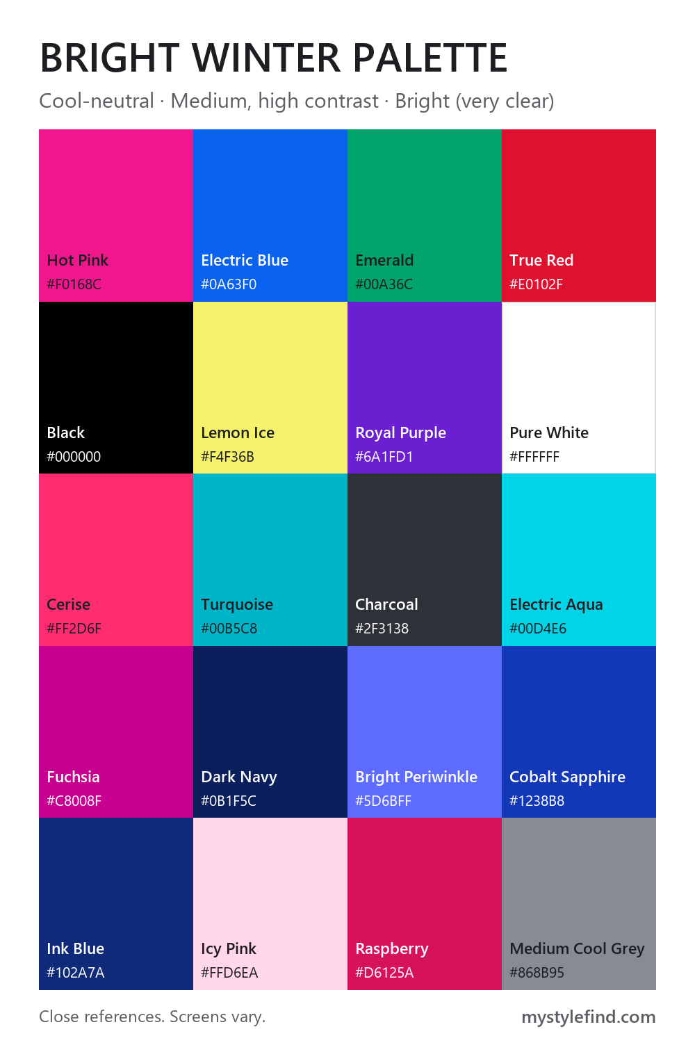
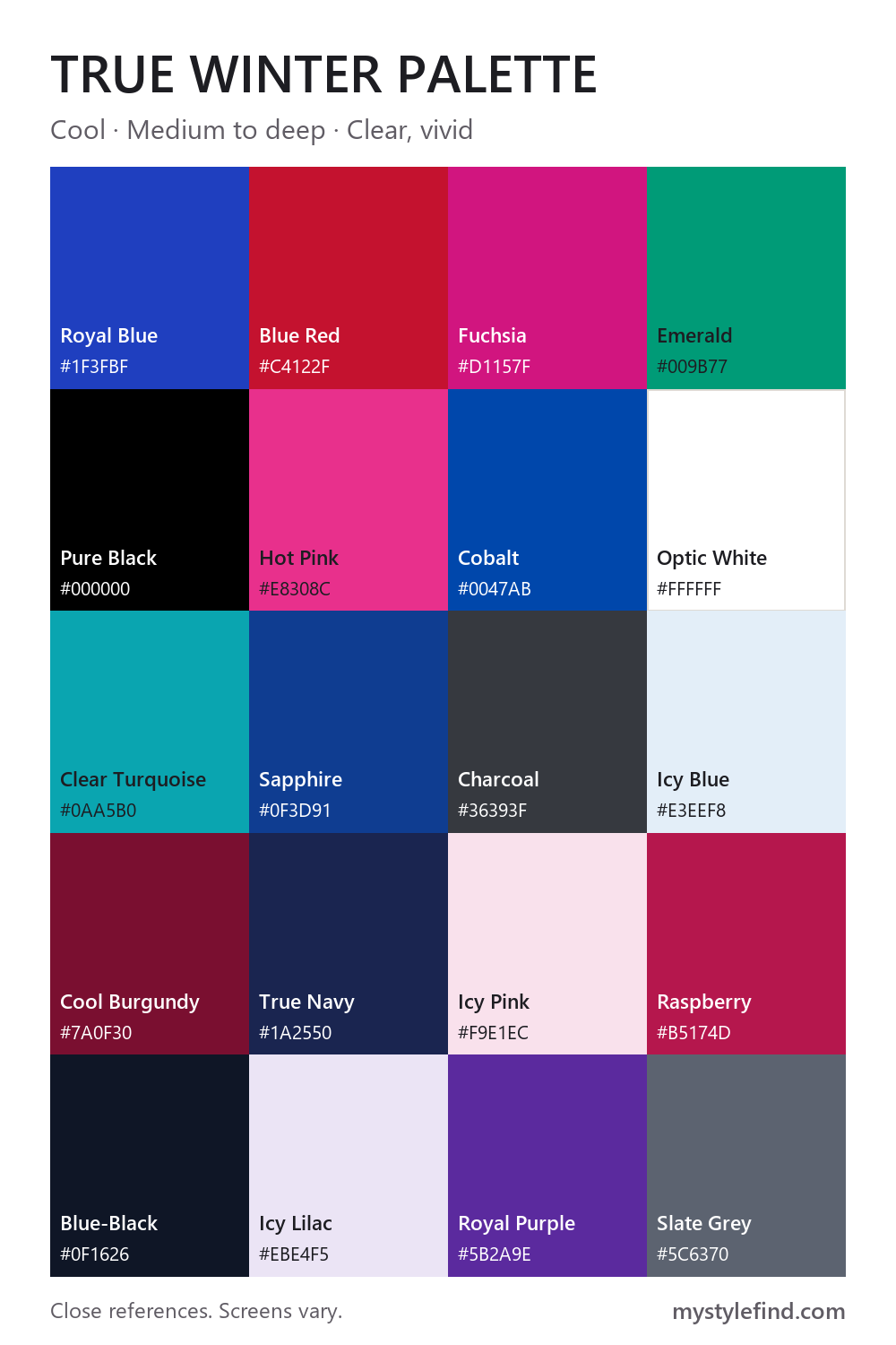
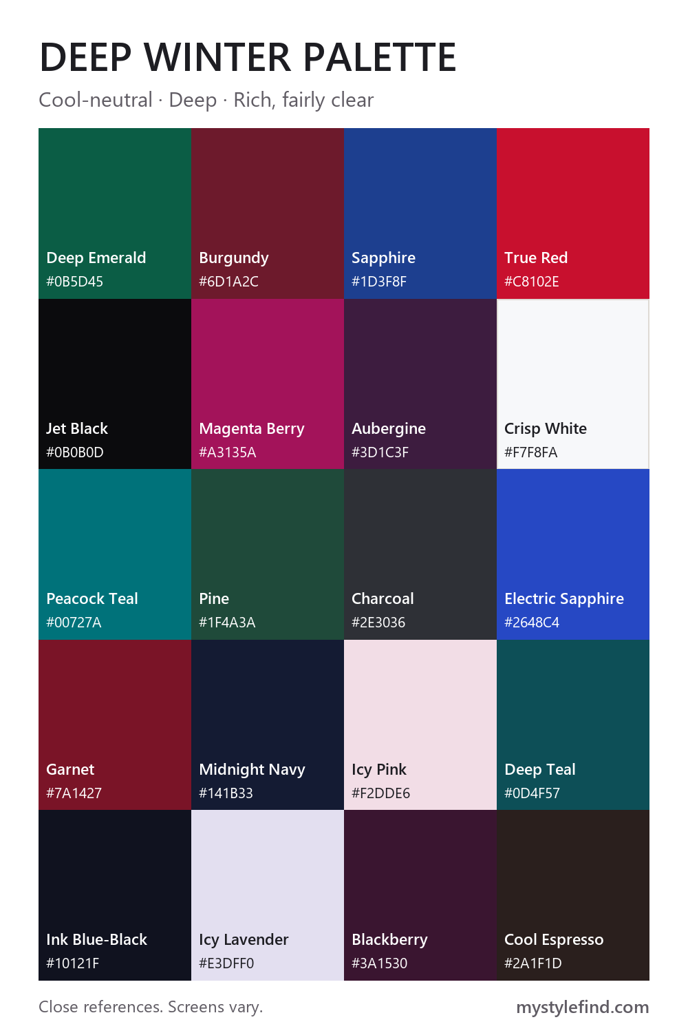
Want every season on one page? See the 12-season color chart.
Which Winter are you?
Read across each row and note which column sounds most like you. Judge your natural coloring where you can, since dye and tanning shift the picture. If one column wins clearly, start with that palette. If two tie, open both season guides and compare their neighbor sections.
On deep skin with dark hair and eyes, contrast between features says little. Skip the first row and rely on how fabric looks next to your face: whether your skin stays rich and even or turns gray or ashy.
| Check | Bright Winter | True Winter | Deep Winter |
|---|---|---|---|
| Overall depth and contrast | High, with a sparkle. Clear eyes stand out against hair and skin. | Medium to high. Cool and defined rather than sparkling. | High or deep overall. Hair and eyes are notably dark. |
| How the coolness shows up | As a lean. Clarity is more obvious than undertone. | Clearly. Blue-based colors look right; gold and orange turn skin sallow or ashy. | Under the depth. Cool-neutral and sometimes hard to read at first. |
| What goes wrong | Dusty, muted colors look flat and dim your eyes. | Golden, orange or olive bases pull against the blue. | Pale warm colors and mid-tone muted ones leave features undefined. |
| Metals that tend to work | Bright silver, white gold and platinum, high shine. | Sterling silver, platinum and white gold, polished. | Silver and gunmetal in high shine, or blackened silver. |
A rough first impression
Find clothes or fabric close to these three colors and hold each under your chin in daylight. All three are blues that differ in clarity and depth, so compare them against each other. Treat it as a first impression. The right color lets your skin look clear and even; the wrong one can make it look gray, sallow or flushed.
- Electric Blue
#0a63f0: points toward Bright Winter - Royal Blue
#1f3fbf: points toward True Winter - Cobalt Navy
#1b2d6b: points toward Deep Winter
If you are between two Winters
Both palettes in each pair contain these close matches, so they are a low-risk place to start while you decide.
- Bright and True Winter: Cobalt Sapphire (#1238b8) and Royal Blue (#1f3fbf); Hot Pink (#f0168c) and Hot Pink (#e8308c); Turquoise (#00b5c8) and Clear Turquoise (#0aa5b0).
- True and Deep Winter: Blue Red (#c4122f) and True Red (#c8102e); Sapphire (#0f3d91) and Sapphire (#1d3f8f); Pine (#04664f) and Deep Emerald (#0b5d45).
If none of these fit
Winter may not be your family at all. Bright Winter borders Bright Spring, which is just as clear but warmer. True Winter does not border another family on the 12-season circle, but True Summer is worth comparing: it is also led by coolness, with softer colors. Deep Winter borders Deep Autumn, which is just as dark but warmer and earthier. If those versions of these colors look better on you, read those guides or take the color analysis quiz.
Winter palette FAQ
Is Cool Winter the same as True Winter?
Usually, yes. Many 12-season systems use True Winter and Cool Winter for the same coolest Winter palette. Deep Winter is also called Dark Winter, and Bright Winter is also called Clear Winter. Names and exact palettes vary from one analyst to another.
Can every Winter wear black?
All three palettes here include black, which is one reason Winter is known for high contrast. It looks different in each: Bright Winter often wants a vivid color beside it, and Deep Winter usually carries head-to-toe black most easily. If it feels heavy near your face, add white or a jewel tone.
Does a Winter palette depend on skin tone?
No. None of the three is tied to a skin depth, so each can apply to light, medium or deep skin. The season describes how depth, coolness and clarity relate across your skin, hair and eyes.
Do I only wear these colors in winter?
No. The name describes the character of the colors, not the month. A Winter palette works all year, and in hot weather its icy tints and clean white are easy places to start. Deep Winters usually do best pairing them with a dark color.
Is seasonal color analysis scientific?
No. It is a styling tradition rather than a tested science, so these palettes are guidance. Two analysts can reach different answers, and nothing here limits what you are allowed to wear.
Explore the other color seasons
Compare all twelve in the seasonal color analysis overview.