What Colors Go With Burgundy? 14 Pairings Ranked by Contrast
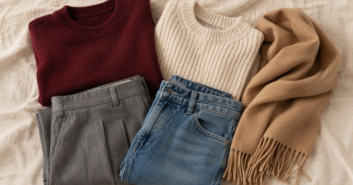
The colors that go with burgundy most easily are cream, white, camel, gray, denim, and black. For something less expected, try blush, mustard, olive, bottle green, or dusty blue. Burgundy is a deep color, so one thing that changes an outfit is how light its partner is: a pale partner looks crisp, while a dark one looks quieter.
To make this list easier to use, we also calculated how far each color sits from burgundy in lightness, so you can get a rough idea of whether a pairing will read as sharp or subtle.
What color is burgundy?
Burgundy is a dark red with purplish undertones. The name comes from the wine of the Burgundy region of France, and Wikipedia’s entry, citing the Oxford English Dictionary, dates its first recorded English use as a color name to 1881. On screens it is commonly written as #800020, the value we use below.
In real clothing, there is no single burgundy. Some versions lean brown, others lean purple, and a velvet will look different from a cotton in the same dye. Treat every example here as a starting point, and test against your own garment.
14 burgundy pairings, ranked by contrast
The contrast figure uses the formula from the W3C’s web accessibility guidelines, which compares how light two colors are on screen, on a scale from 1:1 (equally light) to 21:1 (black against white). The sample colors are representative shades we picked, not official ones, so your own items will vary.
| Sample | Paired with | Lightness contrast | How it reads |
|---|---|---|---|
| White #FFFFFF | 10.8:1 | Crisp and sharp. Think of a white shirt under a burgundy blazer. | |
| Cream #F5EFE0 | 9.4:1 | Softer than white, and easier with warm-toned burgundy. Good for knits and trousers. | |
| Blush #E8C4C4 | 6.8:1 | A pink from the same red family, so it stays gentle despite the strong contrast. | |
| Mustard #D4A017 | 4.6:1 | Bold and a little retro. Often better as a scarf, bag, or shoe than as half of the outfit. | |
| Camel #C19A6B | 4.2:1 | Warm and polished. A camel coat over burgundy is a classic for cold weather. | |
| Dusty blue #7C9CB5 | 3.8:1 | Cool against warm. A less common choice, and it works well in a print. | |
| Mid gray #8E9196 | 3.4:1 | Calm. The burgundy stays the main color and the gray stays out of its way. | |
| Medium denim #5B7A9E | 2.4:1 | The easy everyday answer. Your jeans already provide this. | |
| Olive #6B6B2E | 1.9:1 | Earthy, with a real difference in hue. Good in outerwear and utility pieces. | |
| Black #000000 | 1.9:1 | Polished and safe, but quieter than most people expect. Texture helps. | |
| Navy #1F2A44 | 1.3:1 | Dark on dark. Refined up close, but it can flatten in low light. Add something light. | |
| Bottle green #1B4D3E | 1.1:1 | Nearly opposite burgundy in hue, yet nearly identical in lightness. Rich, and festive if overdone. | |
| Charcoal #36454F | 1.1:1 | Very low contrast, so the look reads as sophisticated rather than graphic. Vary the textures. | |
| Dark brown #4B3621 | 1.0:1 | Almost equal in lightness. A moody tonal look that needs leather, suede, or a lighter layer for shape. |
Two cautions. First, the formula was designed for reading text on screens, and we are borrowing it as a rough ruler for clothes. Second, it ignores hue: bottle green scores just 1.1:1 against burgundy and still looks clearly different from it, because one is green and the other red. A low number does not mean a pairing is bad. It means the pair will not stand out from each other through lightness alone. The ratio also hides direction: olive is lighter than burgundy and black is darker, yet both score 1.9:1.
What the numbers suggest
These groupings are our own rough bands, based on the sample shades above. They are not a standard.
Above about 6:1: clear separation
White, cream, and blush make the burgundy stand out clearly, even from across a room. This is the easiest group for daytime, for work, and for anyone who finds burgundy too heavy. A cream knit with burgundy trousers makes a deep color feel light.
From about 3:1 to 5:1: balanced
Mustard, camel, dusty blue, and mid gray are distinct without being stark. Camel is the safest. Who What Wear’s recent roundup makes the case for yellow, which it calls an unexpected pairing with a retro feel; the same article recommends gray because the two colors never compete.
Below about 2.5:1: low lightness contrast
This group includes black, navy, charcoal, olive, bottle green, and dark brown, along with denim at the top of the range. The lack of contrast in lightness can help explain why burgundy with black can sometimes look flat in photos or in dim light. To fix that, you do not have to change colors. Try one of these:
- Mix textures: a burgundy satin top with black wool, or burgundy suede with dark denim.
- Add a small amount of something light, such as a white T-shirt under a jacket or a pale bag.
- Choose a brighter burgundy, which sits further from black or navy.
Five outfits to try
- Everyday: burgundy sweater, medium-wash jeans, white sneakers.
- Office: burgundy blazer, cream shell, gray trousers, dark loafers.
- Cold weather: burgundy turtleneck, camel coat, dark brown boots.
- Evening: burgundy dress, black jacket, gold jewelry, and shoes in a metallic or a dark neutral.
- More adventurous: burgundy trousers, a dusty blue shirt, and a mustard or leopard-print accessory. Who What Wear argues that leopard print behaves almost like a neutral here.
Before you buy anything, try the pairing with clothes you already own. Our guide to outfit color combinations explains how to test a base, a companion, and an accent in the light you will be wearing them in.
What color shoes go with a burgundy dress?
Pick by the occasion and by how much of a statement you want the shoes to make:
- Black is the simple choice for evening, and matches a black bag or jacket.
- Metallic gold or bronze works especially well with warm burgundies and dressier fabrics.
- Silver suits cooler, purple-leaning burgundies.
- A shade close to your own skin tone keeps the attention on the dress and lengthens the leg line.
- Burgundy shoes in the same or a nearby shade can look deliberate, but an obvious near-miss can look like a mistake. Compare them in daylight first.
- Dark brown or tan suits casual, daytime dresses in cotton or knit fabrics.
Which colors are harder to pair with burgundy?
No color is forbidden, but some take more care. Colors close to burgundy but slightly off, such as a bright cherry red or a wine with a different undertone, can look like a failed match rather than a choice. Very saturated neons compete with burgundy for attention instead of supporting it. If you want to try one of these, use it in a small accent or separate the two colors with a neutral layer.
Does burgundy suit your coloring?
Many people can wear some version of it, but the undertone matters. Hold two options against your face near a window: a warmer, browner burgundy, and a cooler, purpler one. If one makes your skin look more even, use that version near your face and save the other for trousers, skirts, or bags. Seasonal color analysis is a popular way to think about this, though it is a style framework and not a science. Our color palette quiz and the guides to Deep Winter and Deep Autumn show how the cooler and warmer sides of dark reds differ.
Using burgundy at home
The same logic applies to a room, except that the color covers far more area. A burgundy wall absorbs a lot of light, so pairing it with cream or warm white trim keeps the room from closing in. Camel, tan leather, and natural wood give it warmth, while dark green or navy will feel moody and enclosed. Paint a large sample and look at it in the morning and again at night before committing, since dark reds shift noticeably under warm bulbs. A mood board is a cheap way to test the combination with your actual materials.